



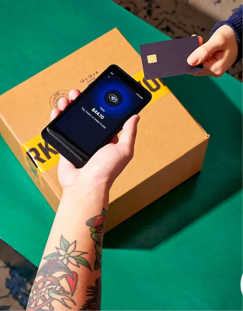


Ecommerce brands sell products online, building identities through a combination of visual design, voice, values, and customer experience.
Your brand influences how customers feel when they buy from you. A strategic brand strategy can encourage referrals, set expectations, and give ecommerce businesses a more human feel—ultimately keeping shoppers coming back for more.
The 14 ecommerce brands below span skincare, apparel, food, and home goods, and each one demonstrates a specific, repeatable branding decision.
What is an ecommerce brand?
An ecommerce brand is the sum of what customers see, read, and experience when they buy from an online store. This includes the brand’s name, design, messaging, and service, all of which distinguish one seller from another.
There are a few core elements of brand identity:
- Logo: The symbol or wordmark customers use to recognize the store at a glance.
- Colors: The palette applied consistently across the website, packaging, and ads.
- Typography: The fonts and text styling used across platforms.
- Imagery: The product photography and lifestyle shots that set the visual tone.
- Voice: The way the brand sounds across product pages, emails, and social channels.
These elements are increasingly important in a large and growing sales channel. The US Census Bureau reported that seasonally adjusted US retail ecommerce sales reached $326.7 billion in the first quarter of 2026, accounting for 16.9% of total retail sales.
Brand identity also plays a role in how store owners themselves say they compete. In a 2025 Shopify survey of store owners,* product quality was the most commonly cited competitive advantage (48%), with brand reputation second (43%)—ahead of price, marketing, and customer service.
Ecommerce brand examples at a glance
Use the table below to quickly find an example that matches wherever your brand needs the most work, then read that section in full.
| Brand | Category | Standout tactic | Your takeaway |
|---|---|---|---|
| Fishwife | Tinned seafood | Illustration-led packaging | Create a visual system customers can recognize across different products. |
| Alfred | Coffee | Los Angeles identity carried across cafés, ecommerce, and social | Use place, products, and recurring visual cues to connect online and offline channels. |
| Pip’s Heirloom Snacks | Snacks | Ingredient-led brand storytelling | Make a defining ingredient or process part of how customers understand your range of products. |
| Dossier | Fragrance | Names and imagery that communicate scent | Use product media to make qualities customers can’t experience online easier to understand. |
| Beauty Pie | Beauty | Plainspoken, comparison-led presentation | Choose a visual style that supports your positioning rather than copying category conventions. |
| Bittermilk | Cocktail mixers | A unique visual system for physical and digital products | Give new products enough variation while creating visual cohesion across the line. |
| Olipop | Soda | Familiar soda cues paired with a different product proposition | Retain the parts of a category customers already enjoy while introducing a new benefit. |
| Meow Meow Tweet | Personal care | Brand voice used in functional store copy | Carry your voice into category pages, rewards, guidance, and other routine touchpoints. |
| Welly | First aid | Play-focused identity instead of clinical presentation | Don’t limit your identity to a product’s function. |
| KOI Footwear | Fashion | Customers placed at the center of the brand story | Support community-led positioning with visible customer participation and evidence. |
| Nerdwax | Eyewear care | Personable language, jokes, and emojis | Use the same language and humor across website copy, social media posts, and other touchpoints. |
| Tsuno | Period care | A social enterprise business model reflected in packaging | Turn a defining structural choice into a recurring creative device. |
| Velasca | Fashion | Artisan and place-based storytelling | Show the people, processes, and locations behind a craftsmanship claim. |
| Our Place | Cookware | Brand-name idea extended into recipes, rewards, and stores | Build supporting content and programs around the central idea customers associate with the brand. |
14 ecommerce brands to inspire your online store
Each of the following examples illustrates a different approach to branding, product storytelling, site design, merchandising, or customer experience, in no particular order.
1. Fishwife
Fishwife is a tinned seafood company founded in 2020 by Becca Millstein and Caroline Goldfarb. Their current range includes tinned fish, caviar, bundles, gifts, merchandise, and a cookbook.

Their packaging illustrations are one of the brand’s most consistent visual elements. Their tins use different color combinations and illustrated characters while retaining a recognizable overall style. The ecommerce site carries that system across individual products, curated sets, gifts, and their build-your-own bundle experience.
The website also connects the packaging to more detailed product storytelling. A “Meet Our Canneries” section explains where selected seafood is sourced and packed.
Look at how brands similar to yours present themselves, then try to find a gap. Fishwife took a category with little brand differentiation and built one around color and illustration.
2. Alfred
Alfred opened their first coffee shop in Los Angeles in 2013 and now operates cafés all over the world, alongside an ecommerce store.

The online store sells products connected to the café experience, including coffee, matcha, syrups, drinkware, merchandise, and subscriptions.
Alfred carries the same recognizable identity across their cafés, ecommerce store, and social channels. A strong sense of place can be a brand asset. Alfred’s Los Angeles references show up consistently across their store, site, and social, giving the brand a specific identity to build around to connect with the local community.
3. Pip’s Heirloom Snacks
Pip’s Heirloom Snacks, formerly Pipcorn, sells popcorn, cheese balls, corn dippers, crunchies, fries, and twists made with heirloom corn.

The company changed their name as the line expanded beyond popcorn, while keeping heirloom corn central to their products. Pip’s Heirloom Snacks uses its website to showcase its star ingredient, with a “Why Heirloom” page that explains what heirloom corn is, follows its growing process, and introduces some of the family farms that supply it.
Turn the story behind your product into a visible part of your brand identity. When one ingredient or production method connects your line, use it to structure both the products you sell and the story around them.
4. Dossier
Dossier is a fragrance brand known for designer-inspired scents alongside their own original perfume collections.

“It’s very difficult to explain the concept of Dossier, and a perfume in general, just by showing a photo of the product,” founder Sergio Tache says.
Since customers can’t smell fragrances through screens, Dossier offers several other ways to compare them. A product name like Musky Buttercream describes the scent profile, while photos translate notes and ingredients into visual scenes. Their AI Scent Finder can also recommend scents, and customers can create miniature perfume sets before committing to full-sized bottles.
If your product is scent- or touch-driven, combine descriptive naming and photography. Use product imagery to make less tangible qualities visible; rather than photographing the product alone, stage it by including ingredients, textures, materials, or settings that reinforce the description.
5. Beauty Pie
Beauty Pie is a membership-based beauty brand that sells skincare, makeup, haircare, and fragrance at what they describe as factory prices.

They lean on plain, unpolished typography and side-by-side comparisons instead of aspirational lifestyle imagery. That plainspoken tone, paired with comparison graphics instead of glossy lifestyle photography, gives the brand a voice that reads as more consumer-advocate than beauty-industry-polished.
If your positioning is about cutting through something like jargon or excess, a plainer, more utilitarian visual style can reinforce that identity better than conventional polished approach would.
6. Bittermilk
Bittermilk is a line of concentrated cocktail mixers created by bartenders Joe and MariElena Raya in Charleston, South Carolina.

Their visual language draws from old apothecary bottles and printed liquor labels. The amber glass, numbered products, decorative borders, small illustrations, and condensed lettering recur across the range. Each flavor receives its own label color and imagery, but the similar bottle shape and label structure make the products recognizable as a collection.
The website extends the same language through its cream background, red and olive palette, retro illustrations, and prominent bottle photography.
A shared visual system like consistent bottle shape, label layout, color, and typography lets you launch new products that immediately read as part of the same brand, even when each one has its own illustration or flavor identity.
7. Olipop
Olipop is a prebiotic soda brand positioned as a healthier alternative to conventional soda.

Olipop’s visual identity deliberately resembles a soda brand rather than a supplement or wellness brand with bold hand-drawn illustration, saturated warm colors, and playful typography. The can design carries that same illustrated style with fruit, flowers, and pattern work.
“That category is about refreshment. It’s about fun. If you’re not doing those things, then people are not going to want to buy your soda,” says Cofounder David Lester.
If your product sits in a category with strong existing associations—soda, in this case—your visual identity can lean into that category’s expectations.
8. Meow Meow Tweet
Meow Meow Tweet is a vegan personal care brand founded in 2009 by Jeff Kurosaki and Tara Pelletier. Their name refers to the founders’ two cats and bird, giving the brand a built-in vocabulary it continues across the customer experience.

Their brand voice is conversational and occasionally playful, while still conveying product information. The face collection opens with, “Your face is already glowing, let’s keep it that way,” while educational content uses lines such as “Put the sandpaper down!” in an introduction to exfoliation.
Your brand voice can show up in the smaller, functional text most brands treat as boilerplate, like category headers, filter labels, or even a subhead on a product listing page.
9. Welly
Welly sells bandages, first aid kits, and refills for all of the above in patterned packaging and reusable tins. Unlike the more clinical approach to first aid branding, their brand focuses on what happens after a minor injury: getting back to play.

With bright colors and fun patterns, Welly positions bandages as something to show off. The brand’s copy also brings the products back to the idea of play, with phrases like “stays on through playtime.”
Welly’ social media presence follows this same approach:
If your category has an established, unexciting visual convention, identity can come from rejecting it. Welly’s core bet is that a bandage doesn’t have to look like a bandage; it can look like an accessory.
10. KOI
KOI is an independent British fashion brand founded in Manchester in 2016. They sell alternative footwear and clothing, including platform boots, Mary Janes, trainers, and heels.

KOI has built a collaborative, alternative identity with unique collaborations and direct address to their customers, who they treat as co-creators. Their “KOI 4 the people” page invites shoppers to request specific styles, with a list of current requested styles and the ability to vote on them.
Decide who’s at the center of your brand story, then support that identity with evidence. KOI puts their customers at the center through community-led language, photos from customers, and a product-request system that signals a brand built with its audience rather than just for it.
11. Nerdwax
Nerdwax makes products for cleaning glasses and keeping them from slipping. Their Jinkies collection turns microfiber cloths into objects shaped or printed like flowers, food, money, underwear, and animals.

In an episode of Shopify Masters, Founder Don Hejny, said, “With Nerdwax, all of our content is very personable. None of it feels like a big brand.” The store reflects that approach. Nerdwax uses emojis, direct jokes, informal sales copy, and comically literal product names such as “A stegosaurus you can clean your glasses with.”
Choose a few verbal devices that customers can associate with your brand, then repeat them across product names, promotions, navigation, and policy copy. Emojis can reinforce that voice, as they do for Nerdwax.
12. Tsuno
Tsuno is an Australian period-care brand founded by industrial designer Roz Campbell. The idea began after Campbell attended a university lecture about girls missing school because they lacked access to period products. She later crowdfunded about $40,000 for Tsuno’s first order and committed to donating half of their profits to organizations supporting women and girls.

Tsuno’s packaging was designed to reflect their business model—just as the brand donates half their profits to charity, they give half the box design to a different artist for each edition.
If your business model has a defining structural choice like a 50/50 split or a matching donation, consider using that same structure as a visual or creative device. Tsuno makes their 50% model recognizable through the same “half” idea in their messaging, packaging, and artist collaborations.
13. Velasca
Velasca was founded to connect Italian craftspeople directly with customers. The brand now sells shoes, clothing, and accessories for men and women, with Italian craftsmanship and style remaining central to how they present the wider range.

In an episode of Shopify Masters, Co-founder, Enrico Casati, said that Velasca invested in storytelling so customers understood that it was “not just a discount website.” Their current website supports that identity through editorial photography and features on artisan families in Italy’s Marche region.
When craftsmanship is part of your brand identity, show the people, places, styling, and processes behind the finished product. This sense of place can be a natural visual theme, and provide valuable context for customers.
14. Our Place
Our Place is a cookware and kitchenware brand founded by Shiza Shahid best known for their multifunctional “Always Pan.” Their brand treats cooking as a shared activity connected to family, culture, and gathering.

CAPTION:
“We strive to put the customer first, and that’s what we’re there for,” says Danielle Hoo, the brand’s director of digital product. The brand plays with that idea through its store’s language and visuals. The repeated references to our place and your place connect products, recipes, rewards, and retail locations to the same idea of belonging.
Build supporting content and customer programs around the idea expressed by your brand name. Our Place extends their focus on cooking and gathering into recipes, community stories, rewards, and stores, making that identity visible beyond their products.
The top branding tips for online retail stores
Each tip below stands on its own; use whichever applies to where your brand is right now.
1. Define the promise behind the product
Start with a clear statement of what the product helps customers do, feel, or experience. That promise should guide the brand’s copy, imagery, packaging, and merchandising.
Welly, for example, organizes their identity around returning to play after a minor injury. Olipop combines digestive-health benefits with the refreshment, familiar flavors, and visual cues people expect from soda.
Write the promise in one sentence, then check whether customers can see evidence of it on the homepage, collection pages, product pages, packaging, and social channels.
2. Create a visual system you can repeat
Create a visual system that can accommodate new products without requiring a new identity each time. These might include a packaging structure, illustration style, type treatment, photography approach, or naming convention.
Bittermilk varies each mixer’s color and illustration while repeating their numbered labels, amber bottles, and vintage references.
On Shopify, reusable sections and metaobjects can help you manage recurring content such as product highlights, icons, artist profiles, or ingredient stories without rebuilding the layout for every product.
3. Bring qualities customers cannot experience online to life
List what shoppers would normally assess in person, like scent, scale, texture, fit, weight, construction, movement, or ease of use. Then decide which combination of copy and product media can communicate each quality.
For instance, Dossier stages perfumes with ingredients and textures associated with their scent profiles, while Velasca pairs finished products with artisan stories and aspirational outfits. These choices give shoppers more context than a standalone packshot can provide.
Shopify product pages can support images, videos, and 3D models. You can also use file-reference metafields when particular products require additional media or downloadable information.
4. Keep product information consistent across channels
A consistent brand identity also includes factual details. So your product names, measurements, ingredients, materials, care instructions, compatibility information, and usage claims should be consistent across your online store, online marketplaces, social commerce listings, and packaging.
In fact, Salsify’s 2025 consumer research found that 54% of shoppers had abandoned a purchase because product content differed between channels. And 71% had returned an item because it didn’t match its online listing.
Shopify metafields can store product-specific details such as dimensions, care instructions, ingredients, and recommended ages, while metaobjects can manage content containing several related fields.
5. Use reviews and user-generated content (UGC) as evidence
Choose social proof that helps customers evaluate the product. A wall of customer reviews can address fit, durability, taste, assembly, or use over time; and customer photographs can show products in contexts the brand’s own photography doesn’t cover.
KOI’s “Worn by the People” section shows customers’ own shoes, supporting their community-centered identity with evidence of how the products are worn and how long they last.
Keep that evidence transparent. The FTC’s Consumer Reviews and Testimonials Rule prohibits practices including fake reviews, incentives conditioned on positive sentiment, and certain forms of review suppression.
6. Give customers an idea they can describe
A recognizable brand is easier to discuss when customers can describe its central idea.
Tsuno applies their 50% model to both profit donations and artist-designed packaging; Our Place reinforces the idea of shared cooking and gathering through their name, recipes, rewards program, and stores; Nerdwax uses informal product names and emojis to preserve their personable voice.
Carry that central idea into the parts of the customer relationship that continue after checkout, including packaging, email, subscriptions, rewards, refills, support, and social content.
This is particularly relevant for newer stores. Shopify’s 2025 survey of store owners* found that word of mouth was the most commonly cited first-year growth strategy, at 53%, followed by building a social media presence, at 35%.
*Based on a 2025 survey of 500 Shopify merchants conducted in English across Australia, Canada, the United Kingdom, Ireland, New Zealand, and the United States. Respondents were established merchants with two or more years on the platform. Results reflect the experiences of this specific sample and may not be representative of all merchants.
Read more
- 6 Tips for How To Be a Successful Dropshipper (Full Playbook)
- How To Sell Sex Toys Online in 2024
- Product Ideas: 17 Places To Find Profitable Products
- 12 Hobbies That Can Make Money
- 8 Time-Consuming Business Tasks—and How to Automate Them Using Bots
- Why Online Reviews Are Essential (and How to Get Them)
- What To Post on Instagram: 20 Great Content Ideas
- 7 Types of Ecommerce Tools You Need for a Successful Online Business
- In-Context & Lifestyle Photography
- Top 10 Best Free Background Remover Tools
Ecommerce brands FAQ
What are examples of successful ecommerce brands?
A few examples include Fishwife, Olipop, Beauty Pie, KOI Footwear, and Our Place. Each has developed a recognizable identity around a specific product promise, visual system, voice, or customer experience.
Fishwife uses illustrated product packaging, while Olipop presents functional soda through familiar category cues and playful branding. Beauty Pie applies a more clinical style to beauty products, and Our Place connects cookware with cooking, culture, and gathering.
The lists of top ecommerce brands vary depending on whether success is measured by revenue, growth, retention, awareness, or another business outcome.
What makes a successful ecommerce brand?
A successful ecommerce brand has a clear unique selling proposition, reliable products, recognizable presentation, accurate product information, and a consistent experience across its online storefront, packaging, email, social channels, and customer service.
The visual direction doesn’t need to follow one formula. While neutral colors may suit one business, another may use illustration or humor. But what’s more important is that the choices align with what the company sells and help website visitors understand why they should buy its products rather than those of other brands.
What is the difference between ecommerce brands and ecommerce companies?
An ecommerce company is the business that conducts online sales. This includes the people, operations, inventory, finances, suppliers, and technology behind the store; it may operate independently or belong to a larger parent company. An ecommerce platform or commerce platform is the infrastructure the business uses to operate. For example, Shopify provides cloud-based software for building and managing an online platform, but it’s not the ecommerce brand itself.
The ecommerce brand is how customers identify and experience that business, including its name, design, messaging, values, products, and service. The company describes how the company works, while the brand describes what customers recognize and remember.
What are the 5 examples of ecommerce?
Five common types of ecommerce include:
- Direct-to-consumer (DTC) brands that sell directly through their own websites
- Online retailers carrying products from several brands
- Marketplaces such as eBay, where multiple sellers reach shoppers through one website
- Subscription businesses that deliver products or services on a recurring basis
- Local businesses that add online shopping, pickup, or delivery to their physical operations
An appropriate online retail model depends on what you sell, where customers live, and whether you want to start selling through your own store or an established marketplace.
How can an ecommerce store brand stand out?
Begin by identifying the clearest difference between your product and available alternatives. Turn that difference into a repeatable system across your store’s voice, imagery, product packaging, product pages, and service.
For emerging ecommerce brands, that means making deliberate choices that help the right customers understand the product and return over time. That can help the store reach more customers without copying the conventions of every other brand in its category.
Why is ecommerce so popular?
Ecommerce lets shoppers compare and buy products without being limited by store hours or location. FedEx’s 2025 ecommerce research found that more than 80% of surveyed shoppers prioritized convenience; 81% expected home delivery, 76% expected free shipping, and 68% expected real-time tracking.
Ecommerce also gives shoppers access to wider product ranges while helping ecommerce businesses reach customers around the world.


